

MIS Reporting Best Practices: Building Power BI Dashboards CFOs Actually Trust
By BiPivot Team · 30 July 2026
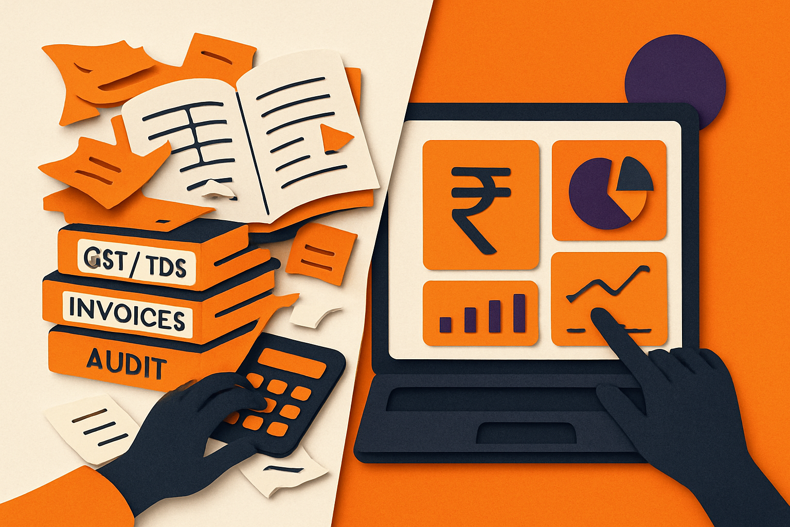
Every mid-sized Indian company we've worked with has the same story: a finance team drowning in month-end Excel reconciliations, a CFO asking "why don't we know this in real time," and a Power BI license sitting half-used because nobody built the model right the first time. MIS reporting isn't a dashboard problem — it's a data discipline problem that happens to be solved with dashboards. This article lays out what actually works.
Why isn't Excel-based MIS good enough anymore for Indian mid-sized companies?
Static MIS packs built in Excel worked fine when businesses ran on monthly cycles and a handful of SKUs. They fall apart when a company has multi-state GST registrations, a dozen bank accounts, and a board that wants answers on a Tuesday afternoon call, not after the 7th of next month. Real-time financial dashboards matter in India specifically because businesses navigate fluctuating currency exposure, intricate GST compliance, and shifting consumer demand simultaneously — moving leadership from reacting to last month's numbers to managing this week's reality, as detailed by Mynd Solutions.
We've written before about why this Excel ceiling is structural, not a training gap — see Why Excel Alone Is No Longer Enough for Mid-Sized Indian Companies. That piece covers the "why move" argument. This one assumes you've already decided to move to Power BI and focuses on the mechanics of doing MIS reporting properly once you're there — because a badly built Power BI dashboard is worse than a well-built Excel sheet; it just fails faster and with more confidence.
Consider a ₹180-crore auto components manufacturer in Pune we advised last year. Their month-end close took 11 working days, largely because three plants sent separate Excel MIS packs that someone in Bangalore had to manually consolidate, tie out inter-unit transfers, and reconcile against Tally exports. By day 9, the CFO was presenting numbers that were already two weeks stale relative to the close date. That lag is the real cost of static MIS — not the inconvenience, but the decisions made on outdated information.
What should a CFO-driven MIS actually measure?
A CFO-driven MIS exists to convert raw transactional data into structured insight that lets management evaluate performance, monitor risk, and guide strategy — shifting the business from reactive bookkeeping to proactive leadership, as CFO Axis frames it. In practice, that means picking a tight metric set rather than reporting everything the ERP can spit out.
For a Power BI-driven CFO dashboard, the metrics that consistently earn their place on the front page are: operating cash flow, free cash flow, cash position and 13-week forecast, current ratio, revenue growth and product/customer mix, gross and operating margins, cash conversion cycle, working capital efficiency, and budget vs. actuals — a set corroborated across multiple practitioner guides including DataRoars, DataSights, and Perceptive Analytics.
Worked example: a Coimbatore-based textile exporter with ₹95 crore annual revenue built their MIS around exactly these nine metrics after years of a 40-tab MIS workbook. Post-rebuild, their cash conversion cycle metric alone — inventory days (62) + receivable days (48) − payable days (35) = 75 days — flagged that a single customer segment (export orders to the Middle East) was dragging the average up by 18 days. That single number, visible on page one of the dashboard instead of buried in tab 27, triggered a credit-term renegotiation that freed up roughly ₹6.2 crore in working capital within one quarter.
If working capital metrics specifically are your priority, we've published a dedicated build guide: Working Capital Dashboard: A Practitioner's Build Guide for Mid-Sized Indian Companies. That article goes deep on the DSO/DPO/DIO mechanics; this one keeps working capital as one metric among nine on a broader MIS canvas.
How do you fix messy, siloed data before it reaches the dashboard?

This is where most Power BI MIS projects actually die — not in the visual design, but upstream, in the data. Financial organizations face an average of 37 distinct data quality issues per 10,000 records, and integration errors account for 42.7% of those problems industry-wide, per research compiled by WJARR. The common culprits — poor data consistency, data silos, incompatible systems, and real-time latency — are well documented by SPEC India and DCKAP.
Mid-sized Indian companies have a specific version of this problem: legacy Tally or older SAP B1 instances with no clean API, a separate CRM for the sales team, bank statements arriving as PDFs, and a payroll vendor emailing an Excel file monthly. You don't need a full ERP overhaul to fix this. A pragmatic, sequenced approach:
- Map the sources first, model second. List every data source feeding your MIS and classify each as API-ready, ODBC/database-connectable, or file-based (Excel/PDF/CSV). A significant portion of data for mid-sized companies is often file-based.
- Push all cleansing into Power Query, never into the visual layer. Power BI offers seamless connectivity across ERP, CRM, cloud databases, and external APIs, with real-time analytics layered on top — per Nasscom's overview — but that connectivity is wasted if raw, unreconciled data is imported directly. A critical and common mistake is importing messy or incomplete data without proper transformation in Power Query — bad data in means bad insight out, as flagged by both Data Analysis India and Joanne Kok.
- Build a staging layer, even a simple one. For companies without a data warehouse, a well-organized set of Power Query queries with parameterized folder paths (so month-end files land in a fixed structure and refresh automatically) is a legitimate "single source of truth" — incrementally built, not a big-bang IT project.
- Reconcile at the source, not the dashboard. If GSTR-2B and your purchase register disagree, fix it in the staging query with a documented reconciliation rule, don't let the dashboard silently net the difference.
A Nagpur-based FMCG distributor we worked with had five data sources (Tally, a distributor management system, bank feeds, an Excel-based scheme/rebate tracker, and manual freight bills) feeding their sales MIS. Building a Power Query staging layer with named, documented transformation steps cut their month-end reconciliation effort from roughly 3.5 person-days to under half a day — not because Power BI is magic, but because the mess got fixed once, upstream, instead of being manually patched every month.
Can Power BI actually help you stay ahead of GST, TDS, and MCA compliance?
This is the angle most generic Power BI articles miss entirely, and it's the single biggest differentiator for Indian finance teams. In India, compliance reporting is governed by multiple, overlapping authorities — the Ministry of Corporate Affairs (MCA), the Central Board of Direct Taxes (CBDT), and the GST Council/CBIC — each with its own thresholds, filing calendars, and penalty structures, as detailed by Patron Accounting. A dashboard that only shows revenue and margin while ignoring compliance exposure is incomplete MIS by Indian standards.
There's a sharper reason to get this right: the GST department actively cross-references Income Tax returns and MCA filings to identify discrepancies and broaden the taxpayer base, per SAG Infotech. If your books, GST returns, and MCA filings don't tell a consistent story, you're not just risking an internal reporting error — you're inviting scrutiny.
Practical build: create a "regulatory reconciliation" page in your MIS dashboard with three linked visuals:
- GSTR-1 vs. books revenue, filtered by GSTIN and month, with a variance threshold highlighted in red conditional formatting.
- GSTR-2B vs. purchase register input tax credit reconciliation, flagging vendor invoices in the books that haven't appeared in 2B for two consecutive months — a common early warning for vendor non-compliance that can block your ITC claim.
- TDS deducted vs. TDS deposited (26Q/24Q) by section code, cross-checked against Form 26AS data pulled in as a monthly file import.
One Ahmedabad-based engineering firm we advised built exactly this page and caught a ₹4.8 lakh ITC mismatch within the first month of go-live — a vendor had stopped filing GSTR-1 for two cycles, and the dashboard flagged it before the annual reconciliation exercise would have surfaced it, by which time the ITC window would have been tighter to defend. That's the practical value of a "regulatory-aware" dashboard: it turns compliance from an annual fire drill into a monthly five-minute check.
What separates a dashboard people use from one that gets ignored?
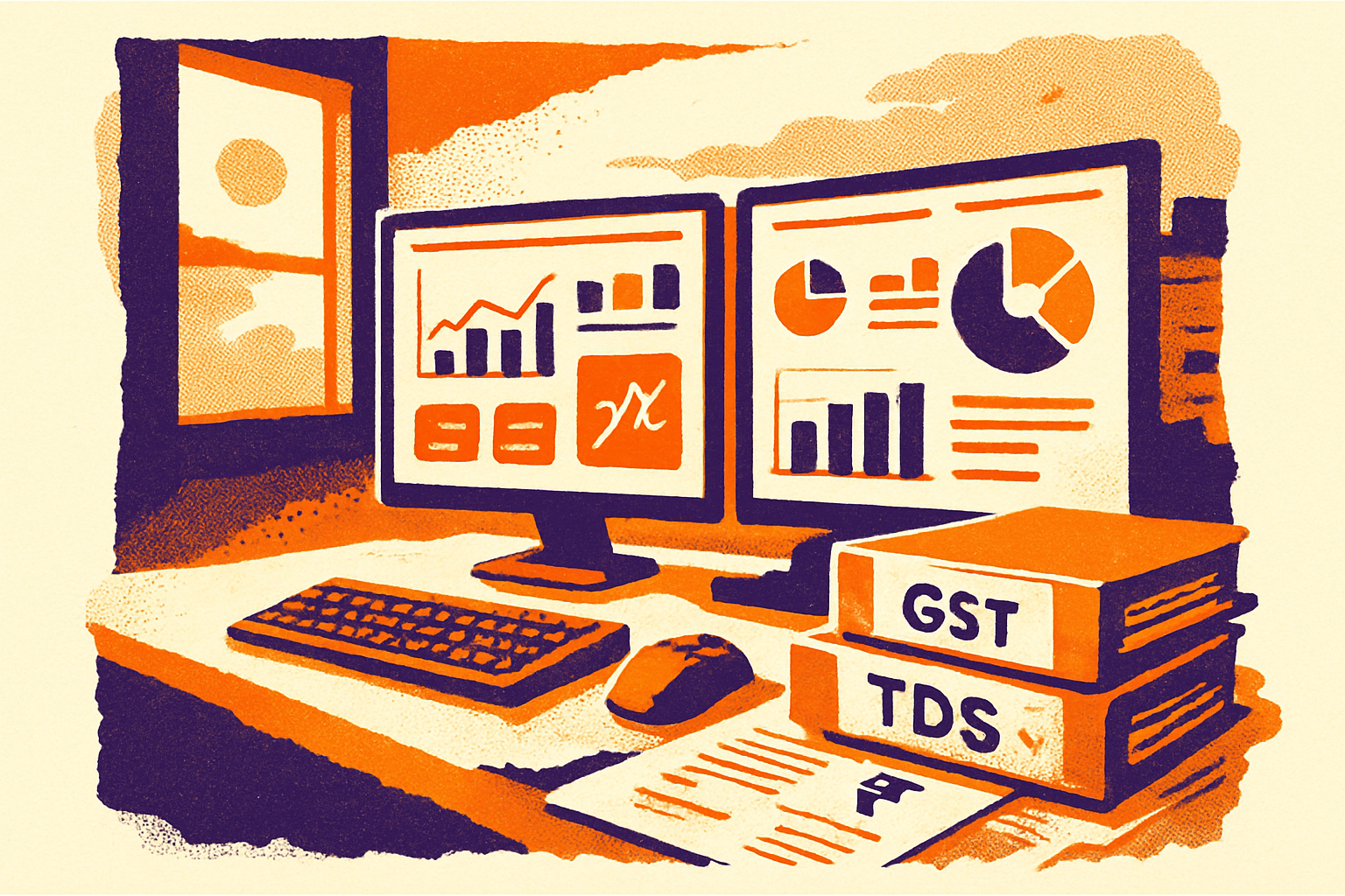
Most failed Power BI rollouts aren't technically broken — they're just unused, because nobody applies basic design discipline. The core principle, echoed across Datameer's guide to actionable financial dashboards, is: define a clear focus question, provide essential context, apply visual hierarchy, and add explanatory annotations so the dashboard anticipates the follow-up question before it's asked.
In practice, that means:
- One dashboard, one question. A cash dashboard answers "will we have enough cash in the next 13 weeks" — it should not also try to answer "which region is most profitable." Split them.
- Visual hierarchy over visual density. The biggest, top-left tile should be the number the CFO checks first every morning. Everything else is supporting detail, accessible via drill-through, not crammed onto the same canvas.
- Clarity over quantity, always. Dashboards for decision-makers should show only essential KPIs, not every metric the data model can produce — a principle stressed by Datameer, Data Analysis India, and Joanne Kok alike. We enforce a hard rule with clients: no more than 7 KPI tiles on the landing page, full stop.
- Annotate the anomaly, don't make people hunt for it. If margin dropped 3 points in June, put a text box on the visual saying why (e.g., "raw material cost spike — copper +14% MoM") rather than expecting the CFO to cross-reference a separate commentary email.
We covered the specific mechanics of turning a monthly P&L review into a live command center in P&L Dashboard Best Practices for Mid-Sized Indian Companies — that article is the right next read if your MIS priority is the profit-and-loss view specifically rather than the broader CFO scorecard discussed here.
How do finance teams build self-service Power BI without constant IT dependency?
Self-service BI is the promise everyone sells and few finance teams actually experience, because the underlying data models are often built rigidly by developers who then become a bottleneck. A frequently cited pain point among Indian finance teams: developers build inflexible variance measures, so every new comparison scenario (say, comparing this quarter to the same quarter two years ago instead of last year) requires an IT ticket — making "self-service" theoretical rather than real, as discussed in this Microsoft Fabric community thread.
The fix is architectural, not a training course. Three specific techniques close this gap:
- Calculation groups instead of hardcoded measures. Rather than building separate DAX measures for "YTD Actual," "YTD Budget," "YTD Prior Year," build one calculation group with a "Time Intelligence" dimension that a finance user can slice by dragging a field — no new measure, no IT ticket, for any new period comparison.
- Parameterized what-if parameters for scenario toggles. A single "Growth Rate Assumption" or "Collection Days Improvement" parameter, exposed as a slider on the dashboard, lets finance run scenario analysis (what if DSO improves by 5 days, what does cash position look like in Q3) without touching the model.
- A documented DAX pattern library, not ad-hoc formulas. Every mid-sized finance team should maintain a one-page reference of the 8-10 core DAX patterns they use repeatedly (YoY %, budget variance %, rolling 12-month average, cumulative cash) so any team member can extend the model consistently rather than each analyst inventing their own logic.
This is also where broader organizational change matters — building genuine self-service capability is as much about how the finance function is structured and skilled as it is about DAX syntax, a theme we explore at the organizational level in How CFOs Can Build a Data-Driven Finance Function. Read that piece for the team and process design; use this article for the specific technical patterns.
It's worth noting the scale of adoption behind this shift: Power BI holds roughly 30-36% of the global BI market with over 30 million active monthly users according to Power BI Tek and ElectroIQ, and over 3,300 Indian companies are publicly identified as users, with actual adoption likely far higher since many firms don't disclose their tech stack. India's BI market itself is valued at roughly USD 329 million, with close to 50% of Indian SMEs now on cloud-based BI tools for their lower upfront cost and scalability, per Ken Research. The tooling is mainstream; the differentiation now is entirely in how well you build the model.
How does MIS reporting become a strategic foresight tool, not just an operations report?
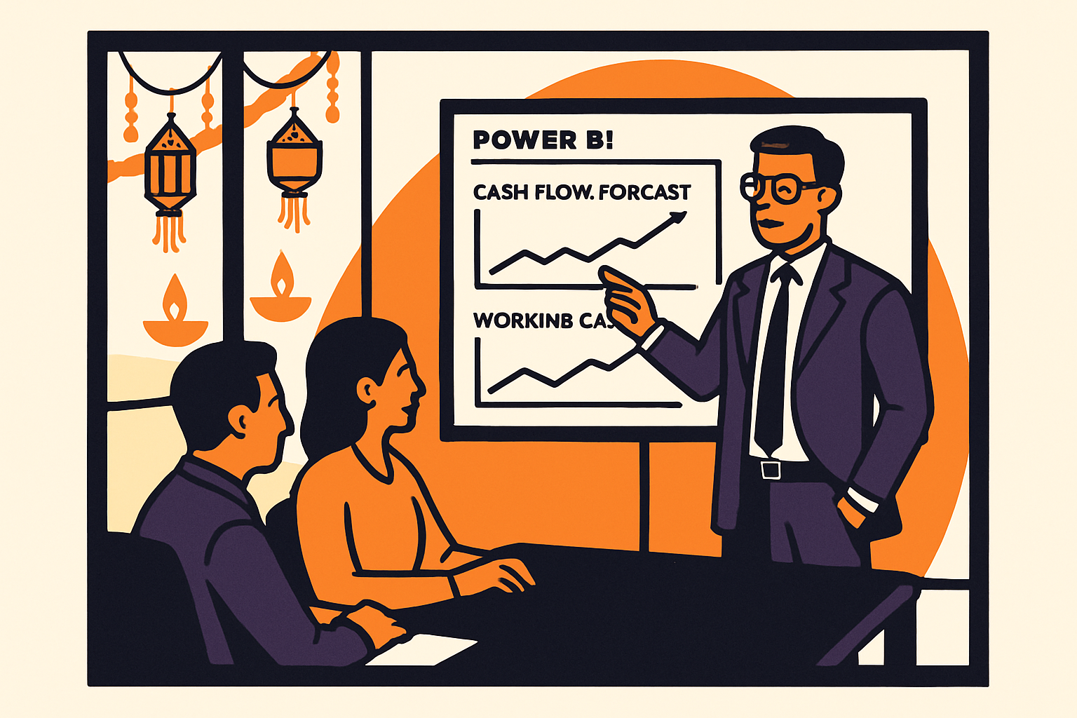
The final maturity step is moving MIS from "what happened" to "what's coming and what should we do about it." This matters more in India than in steadier markets because of pronounced seasonal swings — festive-season demand spikes for consumer goods, monsoon-linked agri-input cycles, year-end capex pushes before March 31 — layered on top of currency and rate volatility.
Ken Research's data shows 65% of Indian enterprises now consider BI tools essential to operational efficiency, and over 70% of financial-sector businesses use BI specifically for risk management and compliance, per Ken Research; globally, BFSI is the single largest BI-adopting sector, holding 25.12% of total BI market revenue in 2025 according to Polaris Market Research. Finance-led strategic use of BI isn't a nice-to-have anymore — it's the sector norm, and mid-sized Indian companies outside BFSI are catching up fast.
Concretely, a strategic-foresight MIS page adds three things a purely operational dashboard skips:
- A rolling 13-week cash forecast with scenario bands (best case / base case / stressed case), refreshed weekly, not just an actuals-only cash position.
- Seasonality-adjusted revenue and working capital projections — for a consumer durables company, a dashboard that shows October-November inventory build-up against last year's actual festive sell-through, so procurement decisions in August are grounded in data, not gut feel.
- A "decision trigger" table — explicit thresholds (e.g., "if collection days exceed 55, escalate credit hold to sales head") baked into the dashboard as conditional alerts, so the MIS doesn't just report the problem after the fact but prompts action at the point it crosses a pre-agreed line.
This is also the layer where automation earns its keep: connecting multiple data sources and automatically distributing recurring reports saves meaningful time in planning, reporting, and analysis cycles, as Jirav notes. A scheduled Power BI refresh plus subscription-based PDF/email distribution to plant heads every Monday morning replaces what used to be a manual Friday-evening Excel-compilation ritual — freeing the FP&A analyst to actually analyze the anomaly rather than assemble the report.
If your foresight priority is deciding between automation approaches — RPA, traditional scripted automation, or AI-driven forecasting — for these MIS workflows, we've laid out the decision framework in AI vs Traditional Automation in Finance: What Mid-Sized Indian Companies Should Actually Choose. And if internal audit is part of your MIS compliance layer, AI for Internal Audit: Practical Use Cases for Mid-Sized Indian Companies covers where AI genuinely adds value versus where it's overkill for a mid-sized audit function.
How BiPivot helps
BiPivot works with mid-sized Indian finance teams to design MIS models and Power BI dashboards that hold up under real scrutiny — from GST/TDS reconciliation logic to calculation-group-based variance reporting that finance teams can extend themselves. If your current MIS is a maze of static Excel packs or a Power BI rollout that never quite became self-service, visit bipivot.com to talk through what a working rebuild looks like for your specific data landscape.